IHSPA Re-Evaluates Evaluation Guide for Whole Book Contest
The 2017 Whole Book Yearbook evaluation & contest saw a small improvement in the evaluation and critique process: It was digitized.
In previous years, it would take several months for yearbooks entered into the Whole Book contest to make it from the staffs, to IHSPA, to the judges, back to IHSPA, and finally back to the media adviser with full evaluation and critique materials. For the 2017 contest, the evaluation was made into a PDF form judges could fill out and email back to IHSPA as soon as they were complete. Advisers received critiques from IHSPA in seven weeks, much sooner in 2017 relative to previous years.
The 2018 Whole Book contest is getting an entirely updated evaluation and critique guide, designed to make judging more intuitive and be more inclusive of different yearbook structures.
Take a Look at the full document by clicking here.
Here are the major changes:
Consolidated Sections
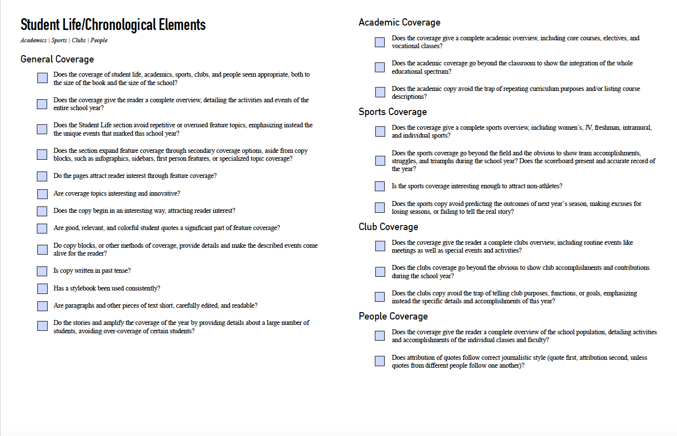
This is perhaps the biggest, most obvious change in the critique guide. Rather than having separate judging sections for Student Life, Academics, Sports, and Clubs, the new guide has a longer “Student Life/Chronological” section that makes up the largest chunk of the guide. Inside “Student Life/Chronological,” there are general evaluation categories, including and overarching “Coverage” category, but there are also distinct aspects of “Coverage” still separated out based on the focus (i.e. sports versus academics).
Why?
The main logic behind merging the student-life-focused sections into one larger section comes from Kyle Phillips, IHSPA president, and Leslie Shipp, Johnston HS adviser. Both Phillips and Shipp agreed that the old version of the critique guide didn’t allow for effective evaluation of both categorical yearbooks and chronological yearbooks. How could a judge appropriately judge a book that covers sports as they fall happen, based on the school calendar, when the guide is under the assumption that all sports layouts are together in a specific section of the yearbook? According to Phillips and Leslie, it is better to avoid that challenge completely with a critique guide that makes no assumptions about the yearbooks’ general structures.
Additionally, combining these sections cut out some redundant evaluation standards that previously appeared in every section of the guide.
This change also separated coverage of “People” in the competing high schools — feature stories, special topics coverage — from the “Portraits” section. This allows for a bit more creativity when it comes to the coverage of students, staff, and faculty in the school without assuming the yearbook staffs opted to add a lot of additional copy blocks or other methods of coverage to their portrait displays. This leaves the option for these pages to have a more clean, individual look than the rest of the book, should the staff want to go that route.
Merged Standards
Evaluation categories like “Graphic Details,” “Typography,” “Illustrations,” and “Design” are now combined into the broader category “Graphic Design.” “Copy,” “Secondary Coverage,” and “Coverage” were also combined into merely “Coverage.” This change cut a lot of redundant language from the critique guide.
Why?
According to Phillips and Shipp, these categories are, in many ways, one and the same. Typography is as much a key element of graphic design as the illustrations that are used to showcase a particular theme.
Standards Language
Some of the individual “Standards” listed beneath each evaluation category have changed for the 2018 contest. Some outdated language has been cut, and some standards have been combined to create larger points about meeting journalistic writing standards, following general graphic design principles, etc.
Examples of this can be seen in the new “Graphic Design” and “Coverage” categories mentioned above. Since older categories were merged, a lot of the language that existed in each of them became repetitive, so important elements were kept and combined appropriately while over-stated standards were tossed.
Other standards were altered to allow for more freedom in specific areas. For example, a standard in the “Portraits” section used to require names of students, staff, and faculty be places beneath the photos. Now, as long as the design is intuitive, the names can be where the staff decides they should be to fit the design. Coverage is also no longer required in the “Ads” section of yearbooks.
Judge Feedback Extension
The new guide features a lot of extra room for qualitative feedback from judges.
Why?
With so much consolidation and yearbook designs becoming more trendy and modern, it is important that judges are able evaluate staffs on more abstract concepts than what can be captured by checkboxes on a form. In 2017, there was also a concern that it wasn’t always easy to see the entirety of judge feedback, so the new form is designed to address those issues.
General Layout
Some adjustments were made to the overall appearance of the critique guide. Summary evaluations now have their own page, immediately following each section. Notes on how to used the critique were moved to the front of the guide, preceding the critique itself. Also, the overall layout is cleaner than the old version.
Those are the major changes judges and staffs will see in the Whole Book Evaluation and Critique Guide.
The deadline – books must arrive in the IHSPA office by September 28, 2018.
Good luck to all who enter the upcoming contest!

