These days, just about everything has a brand. Even schools. The school I used to work for must have spent some cash on creating just the right mascot head. Even our email signature titles had to have the exact Pantone number of purple. While schools are some of the last places on earth to have awareness of a trend, these school’s yearbook have been branding for years. A well-executed yearbook theme brands the particular school during a particular year.
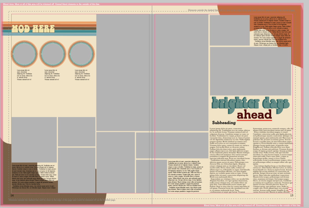
On a recent visit to Johnston High School head editors Giada Grimes and assistant head editor Bria Fisher said they chose their theme, Brighter Days Ahead, because they thought it fit the coming-out-of-Covid era. Sure, this theme could work at about any school in America right now. We discussed ways to tailor it to Johnston, this year. Examples: The football team beat Valley for the first time in 24 years. Yes, the football team always get publicity; however, there are bright spots for every sports and activity that can be highlighted. One would be Senior Sunrise sponsored by the Student Council. Vintage Road Coffee Company supplied the Joe. Walmart gave the donuts. The seniors enjoyed on their third morning reigning supreme in the school. Not only are donuts a bright spot, but the whole event went down about sunrise. Oh, my. Oh, for a photo of a senior gulping coffee with the big sun in the background. Call it opening spread material.
The editors and I also talked about mentioning some of the darker moments. While some schools might want these episodes left out, that is just too Instagram phony. Yearbook staffs write history. History isn’t always pretty.
While the theme is in its infancy, the editors have established a color palette and chosen fonts. They want to incorporate a 70s vibe. And why not, the 70s brought us the Eagles and “Grease”.
Now, how to infuse that theme throughout. Maybe play off the word bright for an academic spread. Find some bright (smart) students. It shouldn’t be hard. Everyone is bright in their own way. Showcase one of the National Merit Finalists. Then, go find the student who welds the best in the school (sparks, bright, in the photo). And the electrician in the School To Work program (wires, outlets, light, you get it).
Other ways to incorporate theme: Mods with “bright” angles. Using colors from the palette for emphasis. Profiles that tell stories of students/staff’s happiest day of the year.
The rough draft to the side of this article utilizes a little color as border around the three circle photos in the mod. Great idea. Maybe use color around one photo to communicate this is the thing to look at first? A little goes a long way. Speaking of going slightly overboard. For me, that’s the color in the two corners of the spread. Why? Its purpose? Looking pretty doesn’t count. And yes, I told them this. I didn’t just post it behind their backs. Good thing is, I’m not their boss. They don’t have to listen to me!
More information about theme:
“Using Your Theme to Develop Your Brand” from the JEA Curriculum Initiative. Your adviser has to be a member of the Journalism Education Association to access this great lesson plan. But worth it. Great examples of profiles with awesome portraits that went with the theme “Calling”. The profiles/portraits showed people’s callings.
“Let’s Talk Theme” from Herff Jones: https://yearbookdiscoveries.com/wp-content/uploads/2020/04/90603403_lets_talk_theme.pdf
Always a great place for ideas. National Scholastic Press Association’s awards archive. Scroll down to Yearbook Theme Package. These are just the ones from 2022. The archive goes back years. https://studentpress.org/nspa/2022-design-of-the-year/
Want Shipp and Drake University’s Timm Pilcher to visit your jlab and dispense the free advice?

