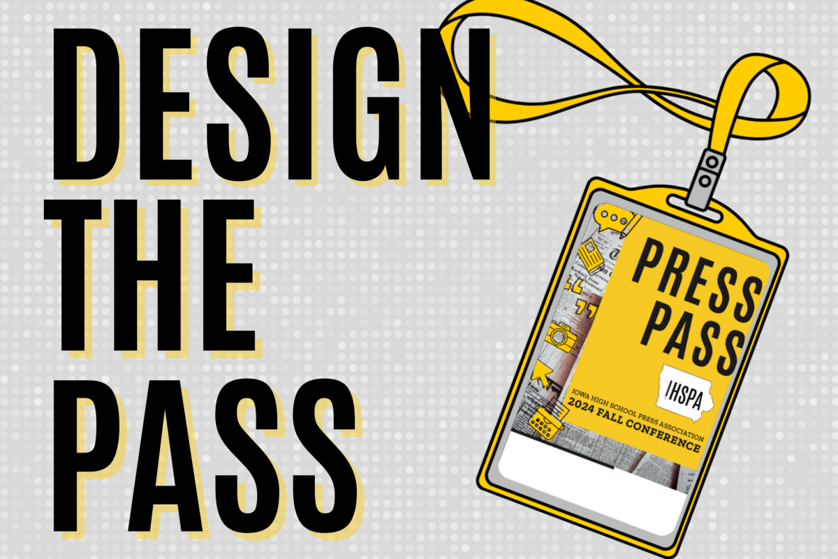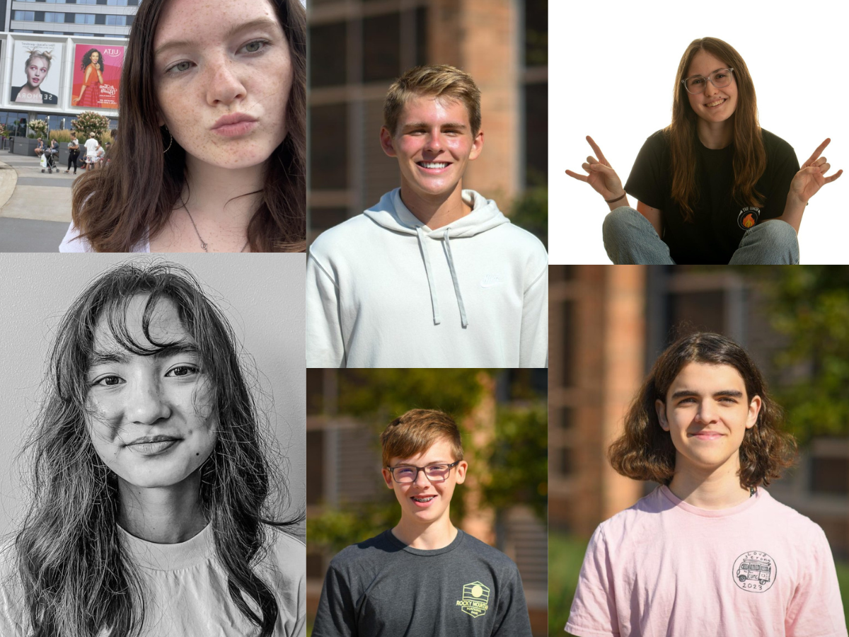
Des Moines East High School’s Christoper Ramirez-Chavez wins IHSPA’s inaugural badge design contest! Christopher’s design will be used for the 2025 Fall Conference badges. Christopher’s design prominently features the IHSPA logo while fulfilling the requirements of the pass. The design was well-thought out and incorporates graphic elements relevant to the conference and the use of the press pass throughout the year. This badge was chosen from among nine entries. The competition was tough with many strong, well-thought out designs.
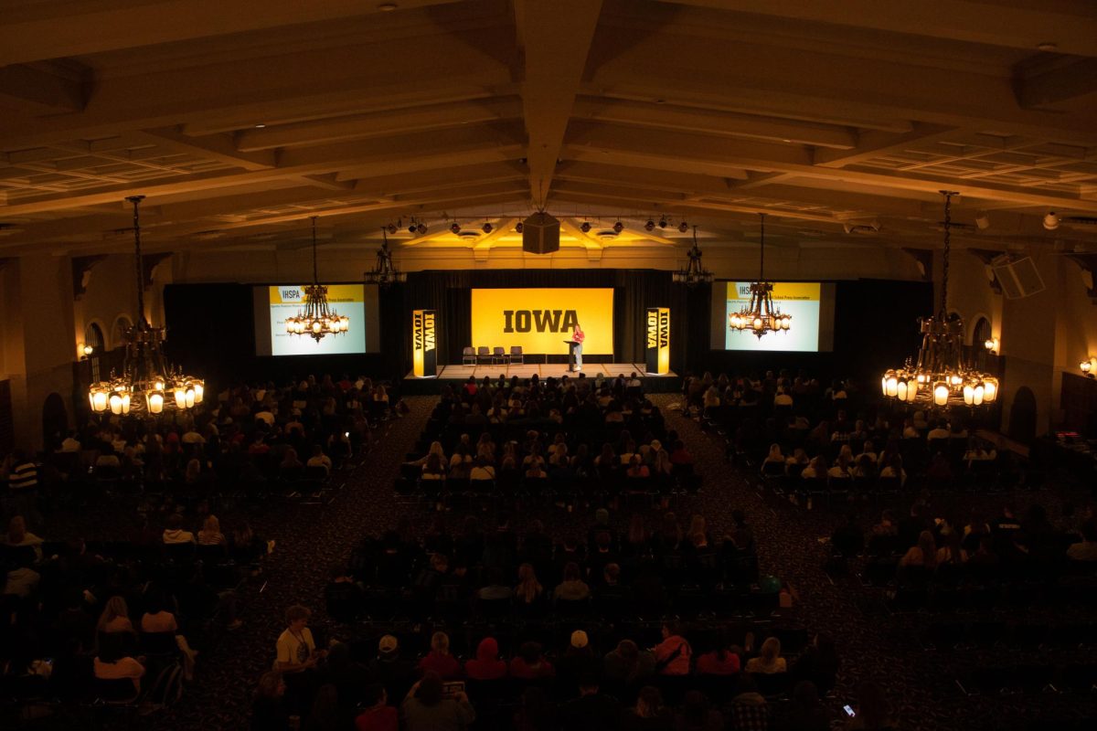
The Iowa High School Press Association created the Badge Design Contest to give students a chance to showcase their design skills and have their design be the official Fall Conference badge.
Read what inspired Christopher’s design here:
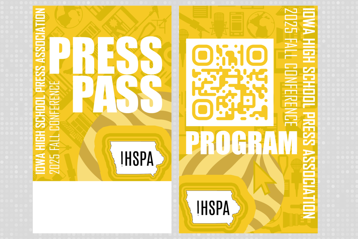
There were a plethora of things that inspired my badge design for the Iowa High School Press Association. The badge was created in Adobe Photoshop. First, when it came to the background, I remembered from previous press pass designs since my freshman year that yellow must be the most dominant force when it came to the primary color focus. I also noticed a heavy influence from the black color scheme in our previous badge designs, but I took it upon myself to focus uniquely on different shades of yellow and aspects of white.
This idea came from my local BP gas station, where BP’s infamous logo mainly comprises different shades of green with a hint of yellow. I was inspired to replicate a similar aspect of that graphical logo in my badge design. The main background yellow is the same shade of yellow used in the 2024 Iowa Press Pass badge design.
The trickiest aspect of this press pass was the main background element featuring silhouettes of key journalism items that a student may typically see in a newspaper or yearbook classroom setting. The idea for the silhouettes came from Nintendo’s Super Smash Brothers series. In the game, each character has a silhouette representing the original game series from which that character came. For example, Mario has a mushroom silhouette to represent him, and so forth. With that inspiration in mind, I wanted to unify various elements of journalism through simple silhouettes.
The background concept also draws from the understanding of good character design. There’s an infamous quote about how a good character design can be recognizable just from its silhouette, and I aimed to replicate that idea. After brainstorming, I determined the list of journalism items to represent in the background. Defining the main images of these items was a difficult process, but with the help of my good friend Google and Canva, I managed to find perfect silhouette models.
For the front design, I thought it would be unique to have the graphic design elements at a 45° angle while keeping the back clear and straight. I believed this added personality and uniqueness, making it easier to identify the front from the back at a glance.
When creating the front design, it was imperative to ensure the Iowa High School Press Association logo was unique and did not merely stand out on its own. To make the logo visually appealing, I wanted to emphasize Iowa’s state outline and have it pop. This idea stemmed from the 2019 TwitchCon San Diego lanyards, which displayed Amazon’s Twitch logo standing out uniquely from the background, despite being a similar shade of purple.
I sought to create a similar effect with Iowa’s outline. However, I didn’t want the logo to simply sit in front of the unique background; there had to be another element. This inspiration led to the circular aspect of the logo design. Initially, it started as a simple circle with a different shade of yellow to make it stand out. After much thought and consideration, influenced by AT&T’s logo and the American flag, I decided to add a stripe element in various shades of yellow. Unlike the AT&T logo and flag design, I wanted to incorporate a unique element by using the filter tool in Photoshop to distort the image, adding a twirl to the stripes to reflect the imperfections inherent in journalism.
Now, regarding the inspiration for the fonts, I knew I needed two prominent fonts. I wanted the “Iowa High School Press Association” and “2025 Fall Conference” fonts to be similar yet unique in their own right. I sought fonts that could be bold enough to make the Iowa High School Press Association segment stand out from the 2025 Fall Conference text. The main font I chose was Agency FB, inspired by Nintendo of America’s 2014 digital events presentation at E3, where they used a similar font throughout their segments. It was unique yet versatile, making it easy to blend into the overall design.
For the most crucial part of the badge design, the section that states “Press Pass,” I knew it needed to be big and bold, easily readable by anyone, including older adults at a sports event. I wanted a font that would ensure any journalist wearing the badge would be easily recognized as reporting on nearby events. I aimed to find a font that could convey this message effectively, a font that speaks loud and clear to the viewers, and I chose Impact. This font became popular during the early days of the Internet for its legibility and effectiveness in conveying ideas. Teachers at my school had printed examples of Impact memes for years, demonstrating its clarity, regardless of size.
Now, regarding the back portion of the badge, the first key element was the silhouette aspect of the background. Unlike the front, where the silhouettes were at a 45° angle, here they are set straight on the page. Additionally, the words “Iowa High School Press Association” and “2025 Fall Conference” were placed in opposite spots compared to the front side. This further helps users quickly identify the front and back.
I wanted to avoid repetition of the striped elements for the Iowa High School Press Association logo on the back, and I was inspired by a golden idea. Throughout my education and experience in journalism, I have been exposed to many key design ideas, particularly the concept of the golden ratio, which helps create balance and harmony. The unique curvature of the golden ratio, which can mathematically go into infinity, fascinated me, and I thought it could be incorporated into the press pass design.
While I modified the curve slightly, it still served as a background element for the Iowa High School Press Association logo. The design resembles a unique blob rather than a strict circular object, distinguishing it from the front part of the badge. I also wanted to add a unique element with the design of the line stripes, incorporating various curves and shapes to express the different paths within journalism.
Lastly, I included a mouse cursor silhouette in the background design. It’s a universal symbol that every journalist has seen. Having it stand out in the badge design was essential, pointing toward the program and the QR code.
I created the QR code on a website called QR Code Monkey, allowing me to color it uniquely and make its edges smoother to match the curvature of my design. It is the same shade of yellow as the background but designed to function well with the amount of white space provided.
These are all the elements that inspired my press pass and program design for the Iowa High School Press Association badge.